Paint
UI Design
Project Overview
Paint aims to simplify the process of selecting paint colors for various projects, whether it's for interior design, home renovation, or artistic endeavors. Users can browse through a wide range of colors, visualize them in different settings, and make informed decisions about their paint choices.
My Role
As the lead UI designer, my role was to conceptualize, design, and wireframe the user interface.
Tools:
Tools
Adobe XD
Timeline
7 Weeks
Goal
To give users a user-friendly interface to explore and select paint colors effortlessly. Additionally, the app aims to offer features such as color matching to enhance the overall painting experience.
Research
Competitive Research
In conducting competitive research, we analyzed existing paint selection apps and platforms such as Sherwin-Williams ColorSnap, Behr ColorSmart, and Benjamin Moore Color Portfolio. Key findings from our research included:
- Varied approaches to color visualization and exploration.
- Integration of augmented reality for in-home visualization.
- User preferences for features like color matching and opportunities for improvement in user interface design and navigation.
Solutions
Based on our findings, we implemented the following solutions to address user needs and enhance Paint:
- Streamlined Navigation: We redesigned the app interface to prioritize key features and simplify navigation, ensuring a more intuitive user experience.
- Augmented Reality Integration: By leveraging AR technology, users can now visualize paint colors in real time within their own environment, improving accuracy and confidence in color selection.
- Inspiration Hub: We introduced an Inspiration Hub featuring curated color palettes to inspire users and spark creativity.
Wireframes
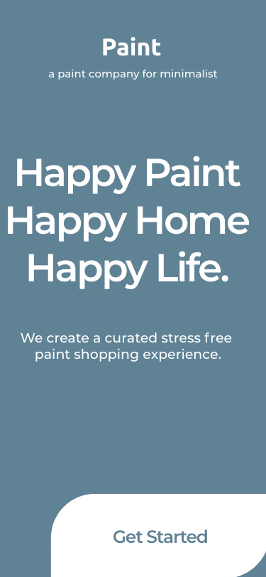
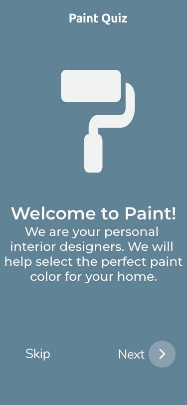
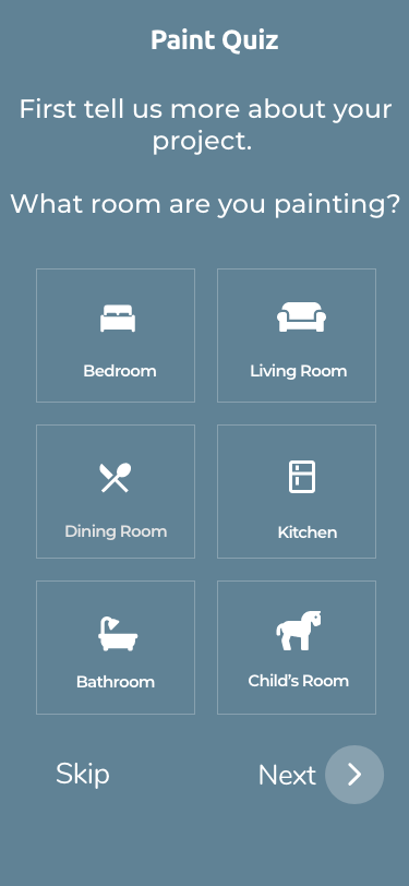
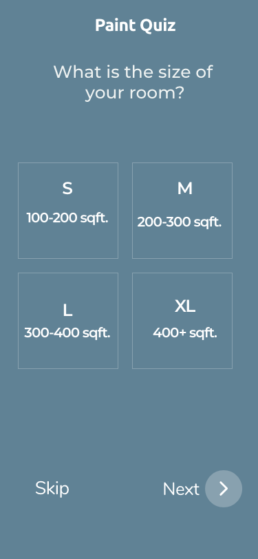
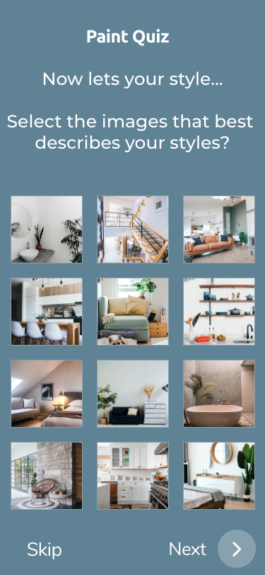
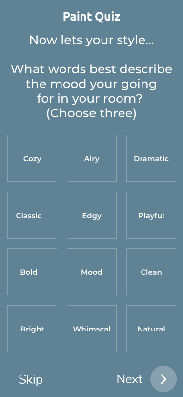
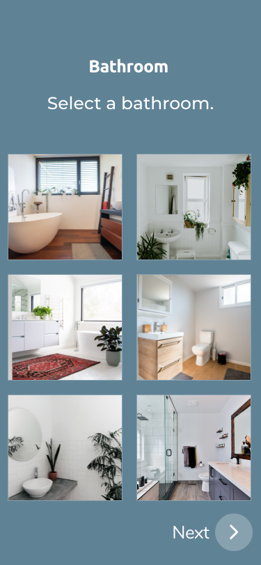
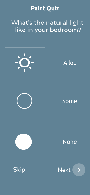
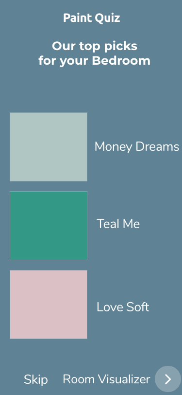

Reflections
The development of Pain was a rewarding journey filled with challenges and insights. By prioritizing my research and staying abreast of industry trends, I created a user-centric platform for paint color selection.